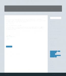
So far I have been living with a make-do color scheme. One of the reasons is that while Kahuna has lots of awesome options for controlling the color scheme, not everything is achievable from the settings, and some CSS hacking is needed. Of course, I am not afraid of CSS hacking. I just did not have the time to do it from the beginning.

Now, it is time to think about the color scheme again.
From the makers of Kahuna, Cryout Creations, a demo for the Parabola theme with many different color schemes is available here. They don’t offer similar functionalities in other demos, since the preset color schemes are only offered to Parabola.
The demo gives me a few hints:
- Background colors better not be too fancy. It could be white, black, gray, or a color that is not one of the accent colors. The reason for the latter is that “accent color on accent color” does not really emphasize anything.
- The two accent colors can be either similar, or contrasting.
- There are a few design choices with regard to whether let the masthead and the footer to share a background color with the main part. Not sharing a color creates a more sectional effect, while sharing the color unifies the page and makes it look like one piece.
Fixing the one-pixel lines
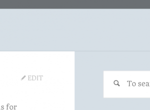
Before working on the color schemes, however, let me first resolve an annoying one-pixel line.
A dig at the source code reveals that the line is intentional.
#masthead { border-bottom: 1px solid #c5ced5; }
Fun. The color is none of the colors I specified in the theme settings, yet it is a grayish blue. The default color for Kahuna is green, thus this grayish blue must be a computed color based on my settings.
OK. I won’t bother to dig how they computed the color. I am going to get rid of it. But here is my attempt at explaining it: they created this one-pixel line because this theme is usually used with a header image. Weird people like me are rare. Even I might adopt a header image some day. I just don’t do it now, because I have no idea what kind of header image might suite me. Anyway, in the presence of a header image, the one-pixel line has a purpose of making sure that the transition between the header image and the background is smooth and clear.
Now that I do not use a header image, the most obvious solution would be changing the 1px line to zero. But wait, we have another possibility:
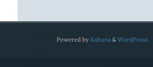
Yeah, we have a five-pixel line in the footer. It looks awesome. What about stretching our 1px line to five pixels too? That’ll make things more interesting. I picked Kahuna because I loved these neat color stripes. Maybe it’s time to add one more.
Tweaking the colors
I found out that what I thought as “black” text is actually gray. I toned the color a bit darker, so that it will have better contrast, and reading long passages of text would be less tiresome.
The secondary accent color has been tuned to be a little more cyan-like. Both accent colors are already blue. I want them to diversify a bit.
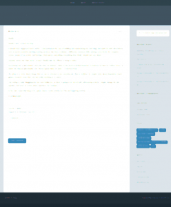
But the most important tweak is the masthead is now dark and the half-transparent background for the header text overlay is gone. I find this has made the template look much simpler. Also, since I do not have a header image for now, the masthead’s height has been greatly reduced.
Here is the reason I picked a complex theme then went on to make it simpler: it is still easier to start with something complex and simplify it, than to start with something minimal, then flesh it out.
End result


